Reporting
You can find several reports under the Reporting menu of most apps that let you analyze and visualize the data of your records.
Selecting a view
Depending on the report, Odoo can display the data in various ways. Sometimes, a unique view fully tailored to the report is available, while several views are available for others. However, two generic views are dedicated to reporting: the graph and pivot views.
Graph view
The graph view is used to visualize your records' data, helping you identify patterns and trends. The view is often found under the Reporting menu of apps but can be found elsewhere. Click the graph view button located at the top right to access it.
Pivot view
The pivot view is used to aggregate your records' data and break it down for analysis. The view is often found under the Reporting menu of apps but can be found elsewhere. Click the pivot view button located at the top right to access it.
Choosing measures
After selecting a view, you should ensure only the relevant records are filtered. Next, you should choose what is measured. By default, a measure is always selected. If you wish to edit it, click Measures and choose one or, only for pivots, multiple measures.
After choosing what you want to measure, you can define how the data should be grouped depending on the dimension you want to analyze. By default, the data is often grouped by Date > Month, which is used to analyze the evolution of a measure over the months.
Using the pivot view
Grouping data is quintessential to the pivot view. It enables drilling down the data to gain deeper insights. While you can use the Group By option to quickly add a group at the level of rows, as shown in the example above, you can also click the plus button (➕) next to the Total header at the level of rows and columns, and then select one of the preconfigured groups. To remove one, click the minus button (➖).
Once you have added a group, you can add new ones on the opposite axis or the newly created subgroups.
Using the graph view
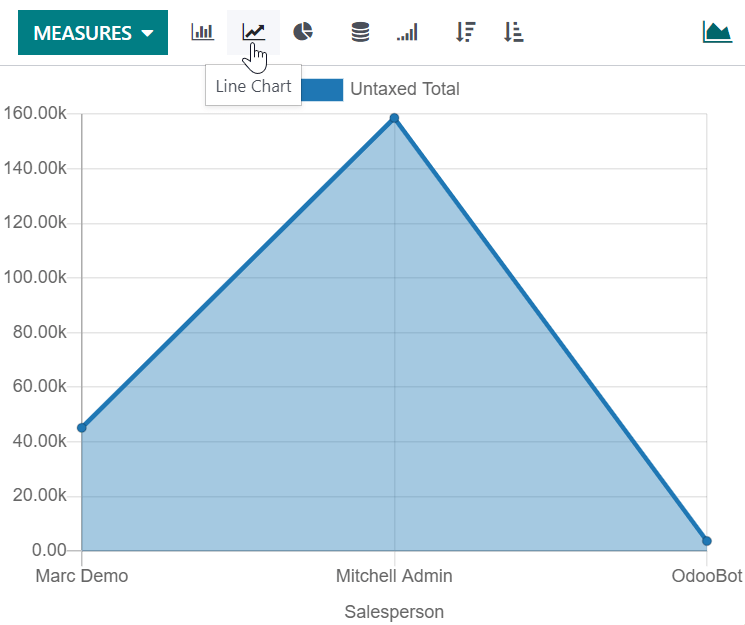
Three graphs are available: the bar, line, and pie charts.
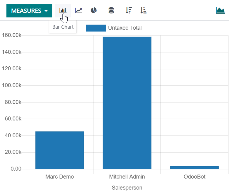
Bar charts are used to show the distribution or a comparison of several categories. They are especially useful as they can deal with larger data sets.
Line charts are useful to show changing time series and trends over time.
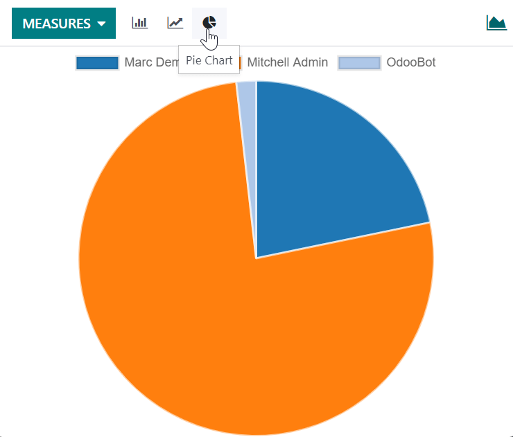
Pie charts are used to show the distribution or a comparison of a small number of categories when they form a meaningful whole.
Bar chart
Line chart
Pie chart